City of Fort Collins Brand#

The City of Fort Collins has specific brand and accessibility standards to ensure the content we share with the public is professional, high-quality and accessible.
Vendors creating products for the City (photos, videos, graphics, written materials, etc.) must also adhere to City brand and accessibility standards.
Specific standards are outlined below. Vendors who wish to work with the City must first pass a brand and accessibility quiz. Passing this quiz is required before project work begins.
After vendors successfully complete training and pass the quiz, the Communications and Public Involvement Office (CPIO) will provide vendors with the City’s brand kit; including the brand guide, logos and fonts as needed. If you have any questions about the City brand please contact creatives@fcgov.com.
Vendor Deliverables#
Before project deliverables are finalized, they must first be reviewed and approved by project managers and CPIO. This is to help ensure all deliverables created for the City meet brand and accessibility standards.
Final project materials should include agreed upon deliverables and packaged files for archiving and future use.
Vendor logos and watermarks are not permitted on final deliverables. Vendors may include deliverables in their portfolios to document prior work, but they should not be used for any other purpose, including any commercial purpose.
City Logo#
-
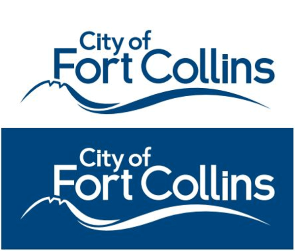
![Two different colored versions of the City of Fort Collins logo.]()
The City logo was copyrighted in July 2008 and is not to be used by any private party or for any use not related to City government without written permission from the City of Fort Collins Communications and Public Involvement Office (CPIO). Questions about use of the City logo should be directed to CPIO.
Need a copy of the City of Fort Collins logo or logo from one of our sub-brands (Transfort, Lincoln Center, etc.)? Request it from us.
The City logo MUST appear on all official City communications and projects.
Need a copy of the City of Fort Collins logo or logo from one of our sub-brands (Transfort, Lincoln Center, etc.)?
![City of Fort Collins logo with proper spacing shown. The width of the]()
The width of the “C” in “City” is the minimum space that should be left along all sides of the logo.
Exclusion Zone: The width of the "C" in "City" is the minimum space that should be left along all sides of the logo.
1 Color Logo Only: The City logo should always be shown in one color format with clear contrast.
Minimum Size: For instances when a small logo is required, the minimum width should be no smaller than 1.125". For digital uses, the minimum size is 100 pixels.
NOTE: On rare occasions, smaller versions of the logo may be necessary, but must be approved through the Communications and Public Involvement Office. The logo must always remain legible and cannot be skewed or squashed in any way.
City Brand#
-
![Display of City's color palettes]()
Colors in the City palette are carefully selected for use on City of Fort Collins-branded materials. This palette contains two sub-palettes (see below) that allow for varying levels of complexity and expression in designing city-branded materials.
-
To meet accessibility standards, the City adheres to the WCAG (Web Content Accessibility Guidelines) AA standard for both digital and print materials. Text and interactive elements have a color contrast ratio of at least 4.5:1.
Our palette offers many combinations of colors, but there is potential to design something that does not meet ADA standards. If you are unsure as to whether a specific color combination will work, we encourage you to reference the suggested color combinations in our brand guide (which will be provided after completion of brand quiz) and use Adobe Color Contrast Checker to determine if a color combination meets recommendations. If it does not, select a different combination.
![Adobe contrast checker tool in use with two of the City of Fort Collins brand colors.]()
-
Typography#
![Image of Gotham Family Font guidelines for styles, weights, and use]()
The City's primary font is the Gotham Family. Styles include Gotham, Gotham Narrow, and Gotham Condensed. Gotham is preferred in the development of City-branded materials.
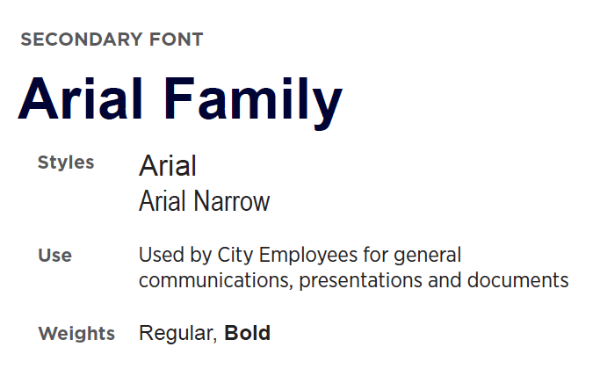
![Example of Arial Family Font and guidelines for styles, weights, and use]()
Our secondary font is the Arial Family. Styles include Arial and Arial Narrow. This font is used City-wide for general communications, presentations, and documents.
Other special fonts may be used for specific projects and sub-brands. Headlines / Display / personality fonts can be used at times but should be used sparingly.
-
All PDF documents intended for digital distribution must be accessibility-compliant. CPIO will review and approve all PDFs created by external vendors before deliverables are finalized.
Creating accessible PDFs from the start is much easier than retrofitting them later. Retrofitting is complex, time-consuming, and requires specialized software and expertise. If your project includes the creation of PDFs, please ensure they meet accessibility standards.
To be considered accessible, PDF documents must meet these standards:
- Text Content is selectable and readable by screen readers. Use live text instead of scanned images of text.
- File Name Descriptors are provided and accurate for document Title, Subject, Author, and Keywords metadata.
- Alternative text for all images, charts, and graphics to describe their content and purpose.
- Headings and Structure: Use proper heading tags (H1, H2, H3, etc.) to define the document structure, aiding navigation for screen readers.
- Tags and Layers: Apply correct tagging and layering to ensure screen readers can interpret the content correctly.
- Tables: Ensure tables have designated headers and a logical reading order.
- Links: Include descriptive text for hyperlinks.
- Language Specification: Define the document's language setting to ensure accurate text-to-speech translation.
- Forms: Ensure interactive forms are accessible, with clearly labeled fields and logical tab order.
- Color Contrast: Use sufficient color contrast between text and background to ensure readability for individuals with visual impairments. Text should have a color contrast ration of at least 4.5:1.
-
![Crowd enjoying downtown businesses.]()
General Photo Guidelines#
The City of Fort Collins is a vibrant and colorful community and our photos should reflect that. Here are some tips when curating or producing photography for the City.
Tell a Story:
- Photos should capture people, nature, infrastructure, landmarks, programs and services that make Fort Collins an amazing place to live.
Be Genuine:
- Avoid capturing moments that feel staged or disingenuous. Lifestyle photography should feel natural to the environment they are captured in.
Crisp & Vibrant:
- Avoid dark or monotone photos that lack clarity.
Avoid Busy Backgrounds:
- If the background is too busy, use a shallow depth of field to compensate when taking candid photos.
Additional Things to Note:#
Credits:
- Photos developed for the City of Fort Collins may be added to the City's photo library.
- Photos will be credited to the City of Fort Collins only and will not include the photographer or 3rd party company's name. No 3rd party watermarks or branding of any kind should be added to City photos.
Resolution:
- Photos provided to the City should be at the highest resolution possible at 300 ppi.
Photography in Public:
- Although taking photos at a public event does not require photo release forms, we ask you to be thoughtful when taking pictures of residents and children, and be willing to avoid specific people or remove photos if asked by a resident.
Accessibility#
All photos posted to social media on in a document should be accompanied with image descriptions (alt text).
-
General Video Guidelines#
Video is a powerful medium that can bring attention to the meaningful work being done at the City. Below are some things to keep in mind if developing a video on behalf of the City of Fort Collins.
City Logo Representation:
- In most cases, the City logo should appear in the early seconds of a standalone video and follow the proper brand use described above.
- Always use the City logo, department-specific logos should not be used unless approved by CPIO.
- City logos should not be embedded into the entirety of the video, but can make appearances at the beginning, potentially on lower 3rds and the end of the video.
Location, Location, Location:
- Fort Collins has many beautiful and iconic places that can serve as a backdrop for interviews or transitions. Videos produced for the City should highlight familiar places and landmarks to establish a local perspective and keep it from feeling disconnected or cold.
Lighting Matters:
- Videos should be toned and balanced so that there is a consistency and vibrancy to the story. Avoid harsh lighting (mid-day sun) or dark locations so that the subjects are clear and well represented.
Capture Quality Audio:
- If interviewing community members, it's important that the audio is professionally captured and balanced before going to production.
Resolution Recommendations:
- All final produced video assets should have a minimum of 1080p quality and be broadcast ready, or, if developed only for social or online use, should be the highest available quality and in the best format possible for the intended platform.
Lower 3rds:
- Lower 3rds should be clearly legible and align with the City's brand standards and font use. Type should be large enough to read and allow people time to read them.
Accessibility#
Closed Captioning:
- SRT files should be included with all videos that capture voice to allow for a more accessible experience. Make sure any lower 3rds or added text elements are placed to allow for captions and reduce crowding or covering important information that is not spoken.
Text and Lower 3rds:
- Any text, including text on lower 3rds should be clearly legible and align with the City's brand standards and font use. Type should be large enough to read and allow people time to read them.


City Style#
-
City voice is clear, approachable and aspirational, with a strong emphasis on transparency, trust and community building. While the tone (formal or conversational, authoritative or friendly) can and should shift depending on the topic, audience, and communication medium, all City communications—whether a social media post, news release, website copy or formal report—should sound like the City.
-
All text should be written in AP Style.
Carefully proofread all written materials. Ask another person to proofread as well; always use spell check.
Use active voice when writing, rather than passive.
Active: “City Council approved the plan …”
Passive: “The plan was approved by City Council …”
Use verbs as verbs, not nouns:
- Yes: “This offer will fund ...”
- No: “This offer will provide funding for ...”
- Yes: “The team will lead the program.”
- No: “The team will facilitate leadership of the program.”
Always write in complete sentences, rather than fragments (possible exception: bulleted lists).
Limit jargon – government, technical, legal, etc. If in doubt, have a nonexpert read it to see if it’s readable and understandable.
-
City of Fort Collins
- City – capitalized if referring to the City as an organization (City of Fort Collins, City staff, etc.). Generally, use “City” only for the City organization, staff or property.
- city – lowercase if referring to the general community (the city population, the northwest part of the city).
Tip: To avoid confusion, it is generally recommended to use a different term (e.g., Fort Collins, the community, etc.) when not referring to the City organization.
Fort Collins (never Ft.)
Community member (never “citizen,” also acceptable: resident, public, people, business, etc.)
Citywide – no hyphen
Regions & Areas
- Downtown: Downtown Fort Collins, the Downtown area, Downtown businesses, etc.
- Old Town: Use only for Old Town Square; everything else is Downtown.
- Northern Colorado
- Front Range
Cities, Towns & Counties
- City of Loveland, Greeley
- Town of Timnath, Wellington, Windsor
- Larimer County, Weld County
MAX Bus Rapid Transit – no “the”
Laporte Avenue – not LaPorte
City Council – no “the”:
Meeting types should be capitalized when referenced specifically, but not generally:
- Yes: City Council Meeting, City Council Regular Meeting, City Council Work Session
- No: City Council meeting, City Council regular Meeting, City Council work session
- Yes: City Council has a meeting today.
- No: City Council has a Meeting today.
Councilmember – one word
Councilmembers should be listed by title (see Titles section for formatting).
When listing multiple Councilmembers, the order should be:
- Mayor
- Mayor Pro Tem
- Individual Councilmembers in numerical district order
Have Questions?
If you have any questions about the City brand, please contact creatives@fcgov.com.